Data visualization can help to understand and analyze statistical data in a more intuitive way by graphing the data. In recent years, it is common to see companies using hand-drawn data visualization in user reports or blogs to make their content and style more relatable. This article lists some common data visualization tools and applicable charts.
| Tools | rough + draw.io | matplotlib.pyplot.xkcd | chart.xkcd & cutecharts | instad.io |
|---|---|---|---|---|
| Scope | For existing draw.io charts, svg charts or charts that need to be drawn directly on the canvas | For data visualization charts, especially those generated by matplotlib or seaborn. Embedded in jupyter labs/notebooks | For data visualization charts with interactive requirements. Embedded in web pages or jupyter lab/notebooks | For existing svg or spreadsheet charts. Can be converted directly to hand-drawn style |
| Charts | Any chart, especially for direct diagrams such as flowcharts, class charts or timeline charts, etc. | Suitable for most data visualization charts, such as line, bar, pie, contour, etc. | Only supports ‘bar’, ‘line’, ‘pie’, ‘radar’, ‘scatter’ | Any chart, only requires DOM input format SVG or PDF charts |
Draw Diagram with Hand-Drawn Style
rough + draw.io
rough is a very powerful hand-drawn style base tool for implementing basic drawing elements in hand-drawn style on Canvas and SVG. rough is a very small js library (~9KB) that defines basic units for drawing lines, curves , arcs, polygons, circles and ellipses as basic units. We can implement hand-drawn images on Canvas by defining some basic units on the js side, a simple example of which is shown below.
rough render code
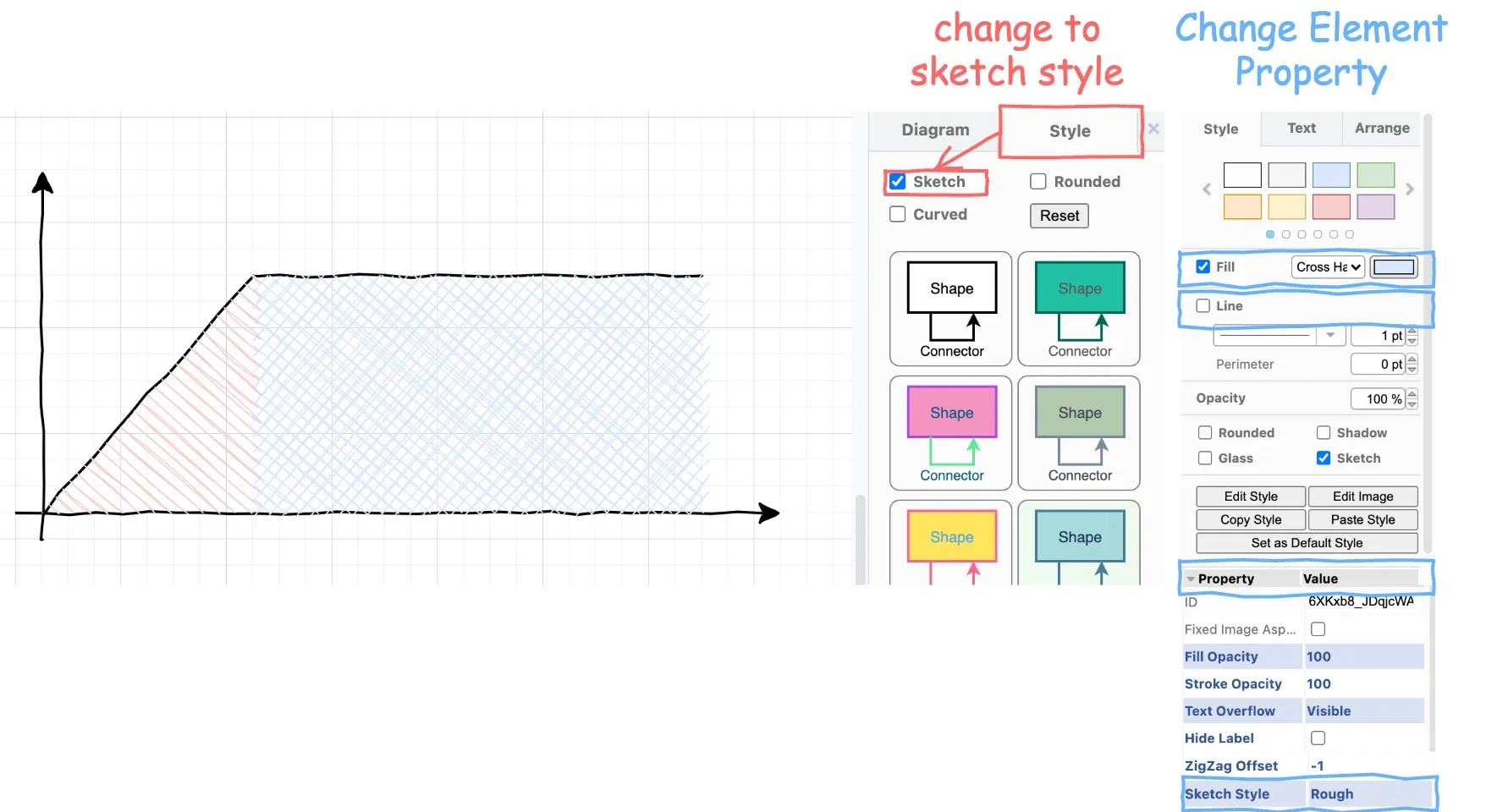
```html rc.rectangle(10, 10, 100, 100, { fill: "red", stroke: "blue", hachureAngle: 60, hachureGap: 10, fillWeight: 5, strokeWidth: 5, }); //overlapping circles rc.circle(200, 60, 80, { stroke: "red", strokeWidth: 4, fill: "rgba(0,255,0,1)", fillWeight: 4, hachureGap: 6, }); rc.circle(250, 60, 80, { stroke: "blue", strokeWidth: 4, fill: "rgba(255,255,0,1)", fillWeight: 4, hachureGap: 6, }); // arcs rc.arc(450, 100, 200, 180, Math.PI, Math.PI * 1.6, true); rc.arc(450, 100, 200, 180, 0, Math.PI / 2, true, { stroke: "red", strokeWidth: 4, fill: "rgba(255,255,0,0.4)", fillStyle: "solid", }); rc.arc(450, 100, 200, 180, Math.PI / 2, Math.PI, true, { stroke: "blue", strokeWidth: 2, fill: "rgba(255,0,255,0.4)", }); // draw sine curve let points = []; for (let i = 0; i < 20; i++) { // 4pi - 400px let x = (400 / 20) * i + 10; let xdeg = (Math.PI / 100) * x; let y = Math.round(Math.sin(xdeg) * 90) + 250; points.push([x, y]); } rc.curve(points, { roughness: 1.2, stroke: "red", strokeWidth: 3, }); ```Because of its small size and ease of use, rough is embedded in many software to achieve hand-drawn style, such as draw.io, which I use a lot. draw.io is a free online diagram editor, which is light and feature-rich, and supports instant store and multi-person online editing. It is an ideal tool for study and work. draw.io supports hand-drawn style diagramming throughrough around 2020, and there is an official blog about this feature. In short, we first need to select the hand-drawn style (sketch) on the right side of the overall chart style, and if we need to fine-tune the hand-drawn style of each element, we need to select the corresponding one by the fill method and line of each element, or even change the sketch style by the property of the drawing unit. If text is needed, the font should be changed to Comic Sans MS. The simple process is shown in the figure below.
With draw.io, you can style most of the diagrams into a hand-drawn style, such as flowcharts.
matplotlib.pyplot.xkcd
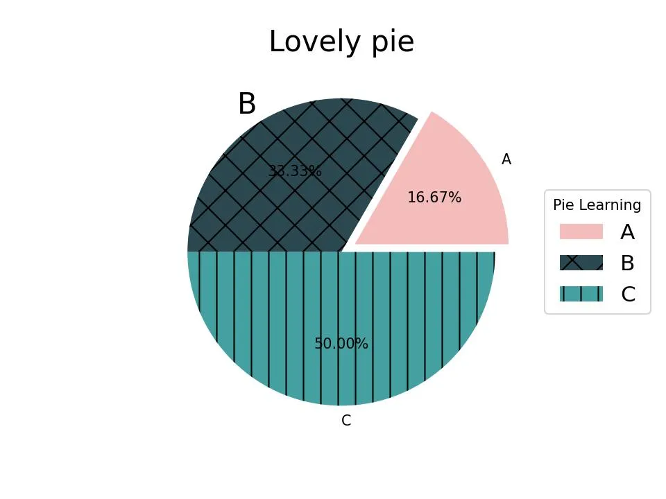
Matplotlib is the most commonly used data visualization library in python. Matplotlib itself also supports hand-drawn style. Matplotlib loads and controls the hand-drawn style through its matplotlib.pyplot.xkcd api. To use it, you just need to put the original matplotlib plot inside of with matplotlib.pyplot.xkcd() scope to convert the image to hand-drawn style. This method is also applicable to the seaborn data visualization library as well, which is based on matplotlib. An example is shown below, Figure 1 represents the pie chart drawn by the original matplotlib, and Figure 2 represents the pie chart converted to hand-drawn style by placing the original matplotlib plot in with matplotlib.pyplot.xkcd().
matplotlib original render code
```python import matplotlib.pyplot as plt plt.figure(dpi=150) patches, texts, autotexts = plt.pie( x=[1, 2, 3], labels=['A', 'B', 'C'], colors=['#dc2624', '#2b4750', '#45a0a2'], autopct='%.2f%%', explode=(0.1, 0, 0)) texts[1].set_size('20')#matplotlib.patches.Wedge patches[0].set_alpha(0.3) patches[2].set_hatch(’|’) patches[1].set_hatch(‘x’)
plt.legend( patches, [‘A’, ‘B’, ‘C’], title=“Pie Learning”, loc=“center left”, fontsize=15, bbox_to_anchor=(1, 0, 0.5, 1))
plt.title(‘Lovely pie’, size=20) plt.show()
</details>

<details>
<summary>matplotlib.xkcd render code</summary>
```python
import matplotlib.pyplot as plt
with plt.xkcd(
scale=4, #the magnitude of the folds, comparing with normal style
length=120, #the length of the folds
randomness=2): #the randomness of the folds
plt.figure(dpi=150)
patches, texts, autotexts = plt.pie(
x=[1, 2, 3],
labels=['A', 'B', 'C'],
colors=['#dc2624', '#2b4750', '#45a0a2'],
autopct='%.2f%%',
explode=(0.1, 0, 0))
texts[1].set_size('20')
#matplotlib.patches.Wedge
patches[0].set_alpha(0.3)
patches[2].set_hatch('|')
patches[1].set_hatch('x')
plt.legend(
patches,
['A', 'B', 'C'],
title="Pie Learning",
loc="center left",
fontsize=15,
bbox_to_anchor=(1, 0, 0.5, 1))
plt.title('Lovely pie', size=20)
plt.show()When using matplotlib or seaborn for data visualization, this method makes it easy and convenient to convert patterns into a hand-drawn style.
Interactive Diagram with Hand-Drawn Style:chart.xkcd & cutecharts
When talking about hand-drawn style data visualization, chart.xkcd and cutecharts are probably two of the most popular tools.
chart.xkcd is a JavaScript library for interactive hand-drawn style data visualization, while [cutecharts](https://github.com/cutecharts/ cutecharts.py) is a wrapper of chart.xkcd to python.
The hand-drawn style effect of chart.xkcd is shown below.
chart.xkcd render code
```html</details>
The api of [cutecharts](https://github.com/cutecharts/cutecharts.py) is very close to that of [pyechart](https://github.com/pyecharts/pyecharts), and the example is shown below.
<svg id="chart_68967376df93415eb5377f0bb8ef5c60"></svg>
<script>
const svg_68967376df93415eb5377f0bb8ef5c60 = document.querySelector('#chart_68967376df93415eb5377f0bb8ef5c60')
const chart_68967376df93415eb5377f0bb8ef5c60 = new chartXkcd.Bar(svg_68967376df93415eb5377f0bb8ef5c60, {"title": "MVP of LOL Bar", "data": {"datasets": [{"label": "MVP", "data": [3, 2, 1]}], "labels": ["Faker", "Easyhoon", "Pawn"]}, "xLabel": "LOLers", "yLabel": "MVPs", "options": {"yTickCount": 3}});
</script>
<details>
<summary>cutecharts render code</summary>
```python
from cutecharts.charts import Bar
def bar_base() -> Bar:
chart = Bar("MVP of LOL Bar")
chart.set_options(
labels=['Faker', 'Easyhoon', 'Pawn'],
x_label='LOLers',
y_label='MVPs')
chart.add_series('MVP', [3, 2, 1])
return chart
bar_base().render_notebook()
# bar_base().render()Similar to pyechart, using bar_base().render() will generate the chart as an html file, i.e. the pattern rendered in the above image, the generated code is as follows.
<!DOCTYPE html>
<html lang="en">
<head>
    <meta charset="UTF-8">
        <script type="text/javascript" src="https://cdn.jsdelivr.net/npm/chart.xkcd@1.1/dist/chart.xkcd.min.js"></script>
</head>
<body>
    <div id="68967376df93415eb5377f0bb8ef5c60" class="chart-container" style="width: 800px">
        <svg id="chart_68967376df93415eb5377f0bb8ef5c60"></svg>
    </div>
    <script>
        const svg_68967376df93415eb5377f0bb8ef5c60 = document.querySelector('#chart_68967376df93415eb5377f0bb8ef5c60')
        const chart_68967376df93415eb5377f0bb8ef5c60 = new chartXkcd.Bar(svg_68967376df93415eb5377f0bb8ef5c60, {"title": "MVP of LOL Bar", "data": {"datasets": [{"label": "MVP", "data": [3, 2, 1]}], "labels": ["Faker", "Easyhoon", "Pawn"]}, "xLabel": "LOLers", "yLabel": "MVPs", "options": {"yTickCount": 3}});
    </script>
</body>
</html>
It is a pity that chart.xkcd and cutecharts have limited support for graph categories, only supporting ‘bar’, ‘line’, ‘pie’, ‘radar’, ‘scatter’. Its api also does not support many features, such as auxiliary lines or additional annotations. And the developer has stopped development around 2019, so it is also hard to support different kinds of charts and functions in the foreseeable future. These limitations make it really hard to be comparable with plotly, echart or pyechart in the most usecases.
There are some other libraries which are similar to chart.xkcd and cutecharts: rough-charts and roughViz are JavaScript library based on rough and d3, and py-roughviz, a python library wrapped in roughViz also implements hand-drawn style data visualization. But its function is similar to chart.xkcd and cutecharts, the api is relatively complicated, as well as more or less stopped the development. Therefore, I don’t introduce the detail of those tools, more reference could be found in the official documentation and examples.
Convert Diagram to Hand-Drawn Style:instad.io
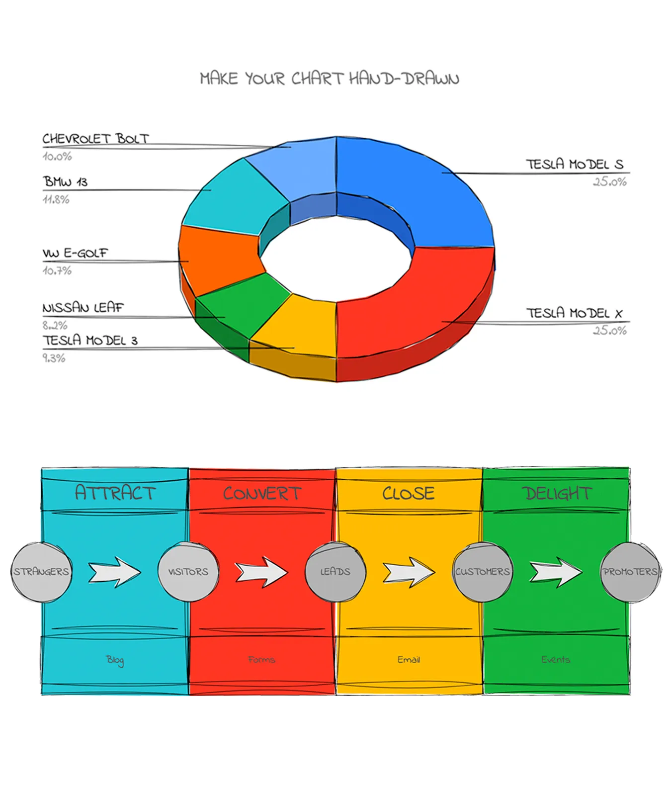
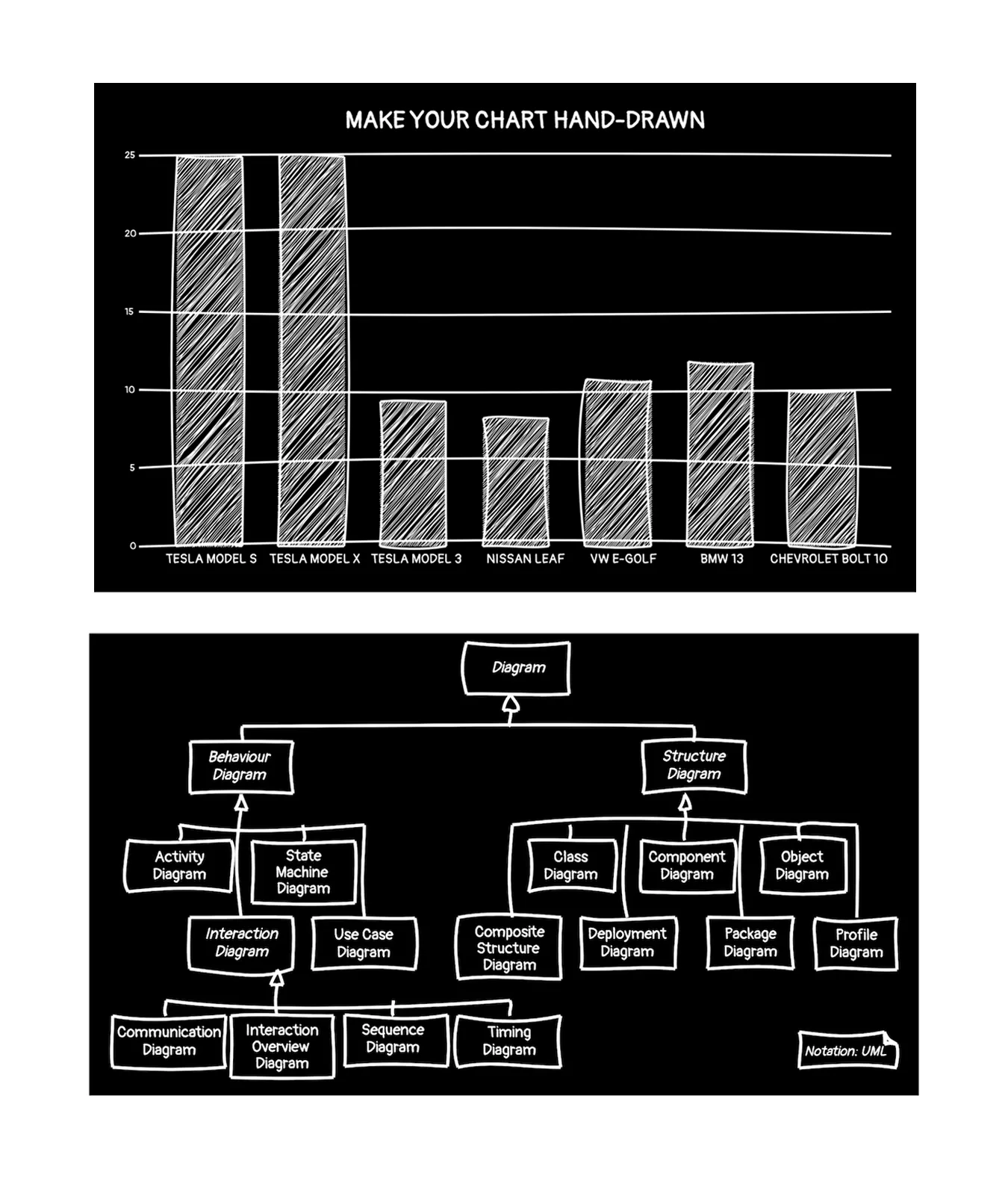
In addition to the above methods, we can also convert existing svg (which can be generated by libraries such as pyechart or matplotlib or software such as draw.io, PS, AI, etc.) or spreadsheet charts by instad.io into hand-drawn style. The result is shown in the figure below. For a detailed example, please refer to instad.io.
The workflow of instad.io is straight-forward: start from a given root DOM element, find all SVG objects, then recursively find all child elements, read out the basic attributes of the child elements, and use roughjs to create a hand-drawn style copy of the element, hiding the original element. This way the hand-drawn style SVG element replaces the original graphic.